
In a world where our phones remind us to drink water, count our steps, and (hopefully) get enough sleep, I set out to design the ultimate Super Health Companion—a mobile app that does all that and more, without being a nagging robot.
This blog post takes you through my UX design adventure, from user research and personas to wireframes and interactive prototypes. I navigated the seven core principles of UI/UX, embraced the Diamond of Design, and tackled challenges like mastering Figma, sketching out user journeys, and deciphering scholarly research without getting lost in a sea of PDFs.
Was it a smooth ride? Not exactly. But just like good health habits, great design is all about iteration, learning, and a little bit of trial and error. Ready to dive in? Let’s go!
User Research and Persona
To truly understand the needs, challenges, and behaviors of my target users for a health companion app, I knew I had to take a user-centered approach. This meant diving into both qualitative and quantitative research methods to ensure the final design would genuinely support individuals managing chronic health conditions.
Primary Research Method
To truly understand the needs, challenges, and behaviors of my target users for a health companion app, I knew I had to take a user-centered approach. This meant diving into both qualitative and quantitative research methods to ensure the final design would genuinely support individuals managing chronic health conditions. I conducted closely-scoped interviews targeting a diverse group of users.
To get meaningful insights, I crafted five key questions:
How do you currently manage your medications and healthcare appointments?
This helped me understand existing solutions and pinpoint areas that needed improvement.
What are your biggest challenges in managing medications or healthcare appointments?
I wanted to uncover pain points like missed doses or scheduling conflicts, which could guide feature development.
What features would you find most helpful in a health companion app?
This question helped me identify must-have functionalities, such as reminders, scheduling tools, and direct communication with healthcare professionals.
How comfortable are you with using mobile health applications?
Understanding users’ tech familiarity helped me decide on the app’s interface complexity and accessibility features.
What concerns do you have when using health-related apps?
I needed to address critical issues like privacy and security, ensuring users felt safe entrusting their health data to the app.
Primary Results
-
I found that users rely on a mix of digital and traditional methods to manage their health. Younger, tech-savvy individuals often use fitness trackers, smartwatches, or calendar apps, while older users prefer paper notebooks, binders, or assistance from family members. Some people depend on pharmacy text reminders or basic phone alarms to stay on track, showing a clear divide in how different demographics approach health management.
-
The most common issues users face include forgetting medications, scheduling difficulties, and tracking health progress. Many struggle with complex medication instructions or managing multiple doctor appointments. Others find it difficult to sync health data across devices or coordinate care for family members, leading to frustration and inefficiencies.
-
A significant number of users want smarter, more personalized reminders that fit seamlessly into their daily routines. Caregivers expressed the need for multi-user access to help manage a family member’s care. Many also requested health data integration with wearables and fitness trackers, offline functionality for travelers, and a simplified medication tracking system for those managing complex regimens.
-
I noticed a wide gap in tech familiarity among users. Younger individuals and professionals expect seamless app integrations and automation, while older adults and those with memory impairments need simpler, more intuitive interfaces with larger fonts and voice-based guidance. This highlighted the importance of designing an app that is both advanced and accessible.
-
Data privacy was one of the top concerns, particularly for users managing chronic conditions. Some worried about alert fatigue from too many notifications, while others were frustrated by unreliable apps that crash or fail to sync properly. Travelers and those coordinating care across multiple providers were especially concerned about limited global or offline support, reinforcing the need for a dependable, privacy-focused design.
Secondary Research Method
To design the ultimate health companion app, I dug deep into scholarly articles and web resources to uncover what truly makes a healthcare app effective. The insights I found shaped key design decisions, ensuring that the app would be user-friendly, engaging, and clinically reliable.
One study from the Journal of Medical Internet Research revealed that 60% of patients with chronic conditions improved their medication adherence when using mobile health apps with reminders. This made it clear—medication reminders aren’t just convenient, they’re essential.
Personalization also proved to be a game-changer. Research in JMIR mHealth and uHealth found that customized health apps saw a 22% boost in user engagement compared to generic ones. This reinforced the idea that the app should offer custom reminders, tailored health tracking, and adaptive notifications to keep users engaged long-term.
But there was a red flag: a systematic review in BMC Medical Informatics and Decision Making found that 78% of healthcare apps lacked input from medical professionals. That’s a staggering number! Without expert collaboration, these apps risk delivering inaccurate or ineffective health management solutions. To avoid that pitfall, I knew that integrating medical expert feedback into the design process was a must.
User experience also plays a huge role in retention. The Journal of the American Medical Informatics Association reported that apps with intuitive interfaces had a 35% higher retention rate after six months compared to those with cluttered or complex designs. This confirmed my decision to prioritize simplicity, clarity, and ease of navigation throughout the app.
Lastly, a study in PLOS ONE found that 67% of patients preferred apps with direct healthcare provider communication. This solidified the need for an in-app messaging system—giving users a way to connect with their doctors, ask quick questions, and stay on top of their health.
Beyond academic studies, insights from Diversido and Nozomi Health highlighted the power of user-centered design in healthcare apps. These resources emphasized the importance of patient feedback, journey mapping, and accessibility—all of which were core considerations in the app’s design.
Persona Creation
Based on survey results and secondary research, I’ve developed the following personas to represent the typical users of the Super Health Companion app. These personas are not just fictional characters—they are reflections of real needs, motivations, and pain points.
My goal was to ensure that the app provides a personalized experience that caters to a diverse group of users, whether they’re health enthusiasts or people looking to manage chronic conditions.
Let’s meet the users who will guide this journey:
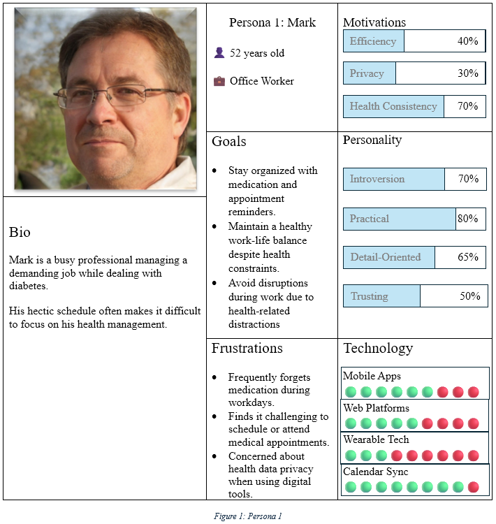
- Mark, the busy professional
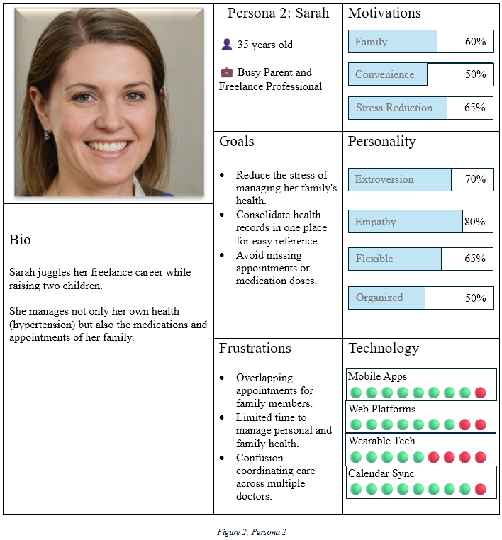
- Sarah, the freelancer with children
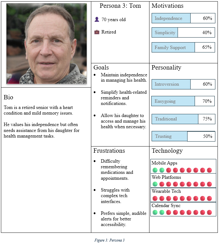
- Tom, the retired senior
User Journey Mapping
From an emotional standpoint, I must consider users’ thoughts, frustrations, motivations, and overall satisfaction at each stage. This helps me identify points of excitement, confusion, or frustration that could impact their experience.

From a technical perspective, I analyze the actions users take, the touchpoints they interact with, and potential obstacles they may face. This allows me to optimize workflows, improve usability, and remove friction points in the app.
The journey is broken into seven stages, from onboarding to the final feedback loop, with a focus on the most common touchpoints, emotions, and pain points encountered at each stage.

Initially, users feel a sense of neutrality (3) as they open the app—a common starting point when using a new tool. They may be eager to see how the app works, but there is also uncertainty regarding whether it will meet their needs. This stage is neither particularly positive nor negative, as users are still exploring and adjusting to the new interface.
Upon setting up reminders for medications and appointments, the emotion shifts to frustration (4). This is often a challenging step for users, especially if there are technical difficulties or if the app’s setup process is time-consuming. There may be difficulties syncing calendars, configuring notifications, or ensuring that the app aligns with the user’s existing schedule. For many, setting up personalized reminders is crucial for the app to be effective, which can add to the sense of frustration when things don’t go as smoothly.
However, after the initial setup is completed, the user experiences a sense of neutrality again (3). While the app is now functional, users may still have doubts about whether the reminders will work as expected or if the app is truly the right solution. This phase represents a brief settling-in period, where users are still forming opinions about the app’s usefulness.
In the following stages, the emotion remains neutral (3) before transitioning to a slightly positive state (2) as users start to see the benefits of the app in terms of improving their health management. Medication reminders are being received, appointments are being tracked efficiently, and the app begins to serve its intended purpose. These moments of success can uplift users, though they may still have lingering concerns.
By the end of the user journey, the emotion reaches happiness (1) as users are fully comfortable with the app, and it successfully integrates into their daily routine. The ease of use and the satisfaction of meeting health goals bring users into a positive state. Despite earlier frustrations, users now recognize the value of the app, and the experience concludes on a high note. This shift toward a positive feeling validates the app’s purpose and reinforces the user’s engagement, ensuring that they are more likely to continue using it.
Preliminary Design
User Flowchart
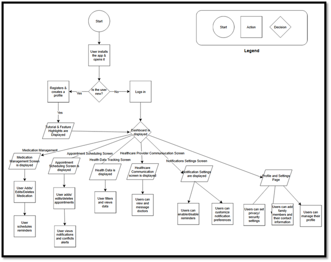
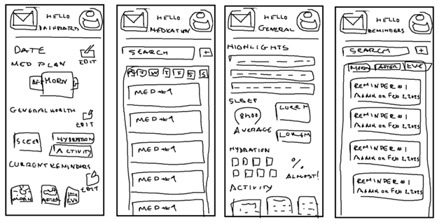
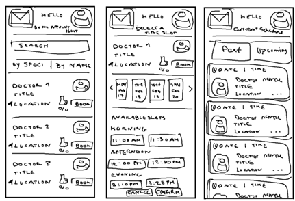
The flow starts with simple processes like filling out sign-up or sign-in forms, receiving a welcome screen, and going through a quick tutorial or feature highlights. Once in, I move to the Medication Management screen where I can add, edit, or delete medications, set reminders, and track adherence. Next, I head over to the Appointment Scheduling screen, which features a calendar view. Here, I can add, edit, or delete appointments, and I get handy conflict alerts and notifications to keep everything in sync.
The next stop is the Health Data Tracking screen. I can view my health metrics through clear data visualizations, and I have the option to filter and dive into specific details. The app also lets me stay in touch with my healthcare providers through Healthcare Provider Communication. Whether I’m sending a quick message, requesting an appointment, or starting a video call, everything is accessible in one place.
Notifications are customizable via the Notification Settings page, allowing me to enable or disable reminders and fine-tune preferences to suit my needs. Then, there’s the Profile and Settings page where I can update personal details, track health conditions, and adjust privacy and security settings. If I’m managing multiple profiles, the Family Health Management screen lets me share reminders and track my family’s health as well.
Key decision points include checking if I’m logged in, which determines access to the app, and whether I want to add medications or appointments, guiding me to the relevant screens.
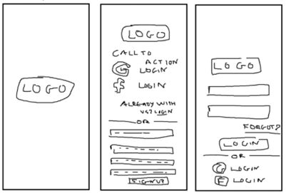
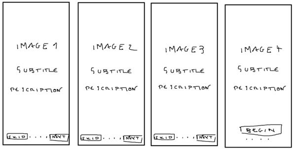
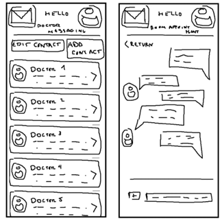
Sketches
When working on the initial sketches for this app, the primary focus was on the overall layout and structure before delving into finer details. Sketching served as a foundation to explore and define information hierarchy, navigation flow, and the placement of key elements. Below are some critical aspects I focused on while sketching:
In the sketches, I visually broke down and prioritized the app’s essential functions. For example, on the dashboard, the primary phases of the day (morning, afternoon, evening) were clearly highlighted. I experimented with different layouts to ensure these phases would visually stand out and be easy to navigate. The color blocks for energy levels were roughly outlined, helping me decide where these elements should be placed within the layout.
Before jumping into the wireframes, I mapped out the user flow in the sketches. I focused on how users would move through the app’s core features—ensuring the flow felt intuitive and that the journey wasn’t overcomplicated. I sketched out how users would navigate from the dashboard to other screens like medication management and appointment scheduling. I also experimented with the placement of navigation elements like buttons and icons.
During the sketching phase, I started thinking about the icons and buttons that would appear on the screens. I included placeholder symbols to help me visualize their placement and size. While the colors and details would come later, the sketches allowed me to decide on the positioning and spacing of elements. For instance, I sketched the arrow icon that would be used for accessing messages, ensuring it was intuitively placed within the messaging screen.
I also focused on how much space would be needed around each informational card in the sketches. I paid attention to the appropriate balance between elements and whitespace, especially in the appointment scheduling screen. I wanted to make sure the cards felt spacious and easy to read, with enough room to avoid visual clutter.
The sketches helped me ensure that the most important user actions—such as adding appointments, editing medication, and sending messages—were easily accessible. I experimented with different button placements and color contrasts for critical actions like using red for important buttons and green for success indicators to make sure users would easily notice and interact with them.
While sketching, I thought about how users would interact with the app in different contexts. For example, I made sure the message input area in the messaging screen was easy to access without interfering with ongoing conversation threads. I decided where attachments should be placed in the messaging interface and whether they should be part of an easily accessible toolbar or attached to each message input field.
In the sketches, I ensured that elements like buttons, inputs, and icons were consistent throughout the app, making it feel like a cohesive whole. I focused on maintaining consistent visual cues, like using the right-angle bracket for opening message threads, which helped create a unified experience across the app.
Wireframing and Prototype Design
Wireframes
Wireframes focused on highlighting interactive elements like buttons, sliders, and input fields. I placed clear action buttons for tasks like adding medications, scheduling appointments, and sending messages in high-visibility areas. This structure allowed me to prioritize actions while maintaining clarity.
With wireframes, I addressed the spacing and size of elements to ensure each part of the UI was easily distinguishable. This ensured that the interface was clean and that important features stood out clearly, like critical action buttons in red or green.
Wireframes helped me establish design consistency across different screens by standardizing visual elements such as icons and buttons, maintaining the same size, shape, and function across the app.
Prototype


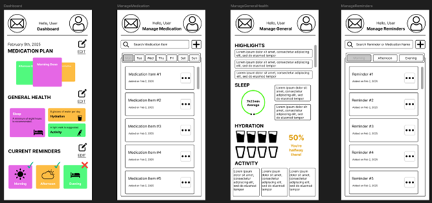
To maintain a balance between vibrancy and comfort, pastel colors were strategically introduced on subsequent pages of the app. While the dashboard uses strong, bold colors to capture attention and signify the user’s primary daily phases, pastel colors help create a warm, calming atmosphere on more detailed pages, like medication tracking and health reminders. This careful transition ensures that the user isn’t overwhelmed by too many vivid tones and fosters an emotional connection with the app. A grayscale palette would have created a monotonous experience, potentially causing emotional detachment from the app’s content.
Symbols are crucial for helping users quickly identify important features or sections of the app. I displayed them in high-contrast black tones to ensure they stand out as intuitive visual guides. This approach makes navigation straightforward, and the black icons align with the clean, minimalist aesthetic, ensuring they are both functional and easily recognizable.

In the wireframe stage, I used black strokes to create clear borders and distinguish different UI elements, establishing a sense of structure. However, as the design evolved, I removed these strokes to align with flat design principles.
To maintain clarity and visual hierarchy, subtle shadows were added beneath rectangular elements like cards and buttons. These shadows give the components a sense of depth, making them appear to “lift” off the screen while preserving a minimalist look.
Each informational card within the interface is predominantly filled with white space to enhance legibility and prevent content from competing with surrounding elements. This focus on whitespace creates a breathable layout and directs the user’s attention to the most important areas.
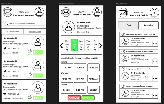
Red was used to highlight critical action buttons within scheduling and appointment management sections. This color is universally associated with urgency and importance, signaling to users that these buttons require immediate attention. Red helps users focus on key interactive elements, ensuring they don’t miss necessary steps.
Green is employed to indicate successful actions or important components that help the user proceed confidently. For example, when a user confirms an appointment, a green indicator signals they can move on to the next step. Green’s association with positivity makes it ideal for elements representing forward movement or successful completion.

As with previous frames, the strong black strokes around informational cards were replaced with a softer, more playful color to ease the contrast between the white cards and the gray background. This change creates a more pleasant and cohesive visual experience. The buttons are distinctly colored to clearly indicate their functions, making it easier for users to understand their purpose.
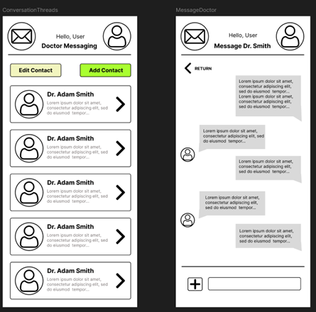
A right-angle bracket icon, resembling an arrow, invites the user to open a message thread with a particular doctor. Along with this, I included a message preview, showing the most recent message in the thread with a slight cut-off and an ellipsis to suggest more content.
When the user opens a message thread with their healthcare provider, they see the most recent messages exchanged. This helps them contextualize the conversation, whether it’s ongoing or has been previously concluded. At the bottom of the screen, separated by a defined line, there’s an input field for typing messages. Next to it, a “plus” symbol button allows the user to upload attachments, such as documents or images.

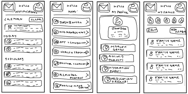
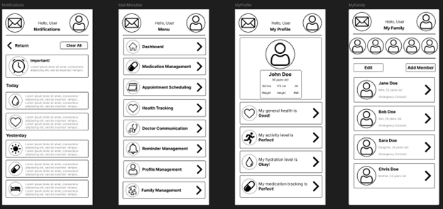
The last four frames of the prototype showcase the menus accessible via buttons in the header and main menu. The left button in the header, represented by a mail icon, opens the notifications view. Notifications are organized by date and severity. The top-priority message, marked as “important,” is displayed first, showing the full contents. Below that, notifications are listed chronologically, each accompanied by an icon and relevant details. Users can swipe to delete individual notifications or tap the “Clear All” button, highlighted in soft red, to dismiss all notifications.
Given the wide range of features in the app, placing access buttons in the footer would clutter the interface. So, I opted to place the feature buttons in a main menu, accessed by selecting the user’s profile in the header. Once the main menu opens, users can easily navigate to any feature, such as personal and family profile management.
The personal profile frame shows the user’s primary and health-related information, offering a snapshot of their status in the four main categories tracked by the app: health, activity, hydration, and medication.
The family profile management frame provides an overview of the user’s family members, allowing them to access each member’s profile or add/remove family members. Certain members are marked as “emergency contacts,” so they can be reached if the app detects any medically concerning metrics within the user’s profile.

Usability Testing
For the usability testing phase, I will ask participants to complete several key tasks to evaluate how well the app supports user needs and intuitiveness. Here’s the breakdown of the tasks:
-
Account Setup and Login
Participants will start by either creating a new account or logging into an existing one. This will help assess how intuitive the login process is and whether the authentication-related screens are clear and easy to navigate. -
Navigating the Dashboard
I will ask users to access the dashboard and review their health data for the day, including activity, hydration, and medication consumption. They’ll also check their progress across different phases of the day (morning, afternoon, evening) to see how easily they can switch between them. -
Viewing and Interacting with Notifications
Users will open the notifications page by clicking the mail icon in the header. I will test their ability to interact with both an important notification and a regular one, checking if they can easily dismiss or clear notifications. -
Managing Personal Health Information
I’ll ask users to open their personal profile and review their health data. They will modify a few entries, like updating activity levels or medication, allowing me to observe whether the process feels seamless and intuitive. -
Scheduling and Managing Appointments
Scheduling an appointment with a healthcare provider will be the focus here. Users will navigate through the scheduling process, including selecting red buttons to confirm their choices, to test if the appointment system is easy to follow. -
Uploading Attachments and Messaging
I’ll have participants open a message thread with a healthcare provider, send a message, and upload an attachment (a document or image) via the “plus” button at the bottom of the screen. This will evaluate how clear and user-friendly the communication features are. -
Exploring the Main Menu and Additional Features
I will ask participants to access the main menu by selecting the profile icon and explore all available features, including personal and family profiles, notifications, and health tracking. This task will assess the accessibility of sections and the clarity of the layout.
Gathering Feedback
To collect feedback, I will use a mix of direct observation, think-aloud protocols, and post-test interviews. During the test, participants will be asked to verbalize their thought process as they complete each task. This will help me understand their decision-making and emotional responses in real-time. After the tasks, participants will fill out a brief questionnaire to rate aspects of the design such as ease of use, clarity, and overall satisfaction.
Analyzing the Feedback
Once the testing is complete, I will analyze the feedback by looking for recurring issues or patterns of confusion. I will consider both quantitative data (task completion times and satisfaction ratings) and qualitative data (observations and interview responses). Common usability issues will be identified and prioritized. Based on the feedback, I will make necessary design adjustments to address these concerns.
For example, if users struggle with navigation, I may need to simplify or clarify the main menu or notification system. After implementing changes, I will conduct another round of testing to validate the revisions and ensure the design improves in usability.
Reflection
Studying the Seven Principles of UI/UX
Understanding and applying the seven principles of UI/UX design—usefulness, usability, findability, credibility, desirability, accessibility, and value—was essential to the design process. Each of these principles guided the decisions I made when designing the application and helped ensure the product was not only functional but also intuitive and meaningful to users.
-
Usefulness: The design needed to focus on solving real user problems. By studying user needs, I ensured the app was relevant and provided features that would truly benefit users in tracking their health and managing their appointments. A feature that wasn’t helpful or aligned with user goals was excluded to reduce clutter.
-
Usability: The ease with which users could interact with the app was prioritized. The app had to be simple to navigate and offer a seamless experience. I worked to minimize cognitive load by streamlining tasks and ensuring that users could intuitively understand what actions they needed to take.
-
Findability: I made sure that critical information, such as health data, appointment schedules, and notifications, was easy to locate. The organization of information was key, and using clear labels and familiar icons helped users find what they were looking for quickly.
-
Credibility: To build trust, the design incorporated clear visual indicators of reliability. For example, icons were standardized, and any health data was presented in a way that was easy to interpret, backed up with trustworthy, evidence-based information when necessary.
-
Desirability: I focused on creating an engaging and pleasant user experience. The use of color and an aesthetically pleasing interface made the app feel more approachable, encouraging users to keep using it.
-
Accessibility: The design prioritized accessibility, making sure the app could be used by people with various disabilities. Features like high contrast mode, screen reader compatibility, and adaptable text sizes ensured the app was usable by a wider audience.
-
Value: The app needed to deliver consistent value, both in terms of usability and functionality. By continuously considering how each feature added to the user experience, I ensured that users would feel the app was worth their time and effort.
The Diamond of Design and Deliverables
The Diamond of Design is a design thinking framework that encourages both divergence and convergence. In the initial stages of the project, I explored a variety of possibilities and gathered as much user data as possible. As the process progressed, I gradually narrowed down my focus to create refined deliverables that would ultimately meet the users’ needs and expectations. This iterative process helped me deeply understand the users’ pain points and desires, which guided the design decisions.
The deliverables I produced as part of the design process included:
-
User Research: Through interviews, surveys, and competitive analysis, I gathered valuable insights about user needs and frustrations. This research laid the groundwork for everything that followed, ensuring the app was designed to solve real problems.
-
Personas: I created detailed personas to represent the target users, each reflecting key motivations, pain points, and even real quotes. These personas allowed me to keep the user’s perspective at the forefront throughout the design process, ensuring decisions were user-centered.
-
Journey Map: I mapped out the entire end-to-end experience of the user, identifying pain points, moments of delight, and touchpoints where the user interacts with the app. This mapping process helped me pinpoint areas to streamline the user journey and remove friction.
-
User Flowchart: I designed user flowcharts to visualize the steps users would take to accomplish tasks within the app. These flowcharts helped me optimize the structure of the app, ensuring users could easily complete tasks without unnecessary confusion.
-
Sketches: Early sketches allowed me to quickly visualize and iterate on layout ideas. This low-fidelity step enabled me to gather feedback early in the process, saving time before diving into higher-fidelity designs.
-
Wireframes: I translated my sketches into more detailed wireframes, planning out the layout, navigation, and interactions. These wireframes served as the blueprint for the app’s interface, guiding its structural design.
-
Mock-ups: Once the wireframes were in place, I added color and branding to create more polished mock-ups. This made it easier for stakeholders to visualize the final product and also served as a tool for user testing.
-
Interactive Prototype (Figma): Finally, I created an interactive prototype in Figma. This allowed me to simulate the app’s user experience, test its flow with real users, and iterate based on feedback to ensure the app would meet the users’ needs effectively.
Challenges Encountered
Throughout the design process, I encountered several challenges, especially with tools and methods that were unfamiliar or new to me.
-
Learning Figma: The learning curve for using Figma was initially steep. While the tool offers powerful features for collaboration and prototyping, it took some time to get comfortable with its interface and functionalities. To overcome this, I watched tutorials, consulted online forums, and practiced by recreating simple interfaces before moving on to more complex designs.
-
Using Excel for User Research Graphs: Excel was useful for organizing data, but it wasn’t ideal for visually representing the complex user research findings. It had limitations in creating clear, digestible graphs that conveyed key insights from surveys and interviews. Eventually, I switched to more specialized tools like Google Data Studio and Tableau for a more professional and intuitive presentation of the data.
-
Finding Scholarly Sources: Researching scholarly sources, particularly those at the intersection of UX design and health tech, was a challenge. Many articles and case studies were either too niche or not directly applicable to my specific use case. I overcame this by broadening my search to include general UX design principles and adapting them to fit the needs of the app.
-
Sketching: Sketching was an essential first step in ideation, but I initially struggled to capture my thoughts quickly and translate them into meaningful designs. Over time, I focused more on functionality and flow rather than getting bogged down by details. The sketches became less about precision and more about visualizing key interactions.
-
Creating Wireframes: Translating sketches into wireframes posed another challenge. This process required a lot of precision and attention to detail, and I had to strike a balance between creating something functional and keeping the wireframe simple enough to iterate on. Feedback from stakeholders during this stage was crucial in refining the design.
Despite these challenges, each obstacle became a valuable learning opportunity. Pushing through the discomfort of new tools and methods helped me produce a final design that was both effective and user-centered.
Appendix
-
Y. Peng et al., “Effectiveness of Mobile Applications on Medication Adherence in Adults with Chronic Diseases: A Systematic Review and Meta-Analysis,” Journal of Managed Care & Specialty Pharmacy, vol. 26, no. 4, pp. 550–561, Apr. 2020, doi: https://doi.org/10.18553/jmcp.2020.26.4.550.
-
A. J. Lazard, J. S. Babwah Brennen, and S. P. Belina, “App Designs and Interactive Features to Increase mHealth Adoption: User Expectation Survey and Experiment (Preprint),” JMIR mHealth and uHealth, Apr. 2021, doi: https://doi.org/10.2196/29815.
-
L. Dayer, S. Heldenbrand, P. Anderson, P. O. Gubbins, and B. C. Martin, “Smartphone medication adherence apps: Potential benefits to patients and providers,” Journal of the American Pharmacists Association, vol. 53, no. 2, pp. 172–181, Mar. 2013, doi: https://doi.org/10.1331/japha.2013.12202.
-
R. Schnall et al., “A user-centered model for designing consumer mobile health (mHealth) applications (apps),” Journal of Biomedical Informatics, vol. 60, pp. 243–251, Apr. 2016, doi: https://doi.org/10.1016/j.jbi.2016.02.002.
-
E. Team, “The New Wave in Digitalization of Healthcare: Going From Niche to Super App,” Emerline.com, 2022. https://emerline.com/blog/from-niche-to-super-app (accessed Feb. 23, 2025).
-
V. Pérez-Jover, M. Sala-González, M. Guilabert, and J. J. Mira, “Mobile apps for increasing treatment adherence: Systematic review,” Journal of Medical Internet Research, vol. 21, no. 6, p. e12505, 2019, doi: https://doi.org/10.2196/12505.
-
I. Vaghefi and B. Tulu, “The Continued Use of Mobile Health Apps: Insights From a Longitudinal Study,” JMIR mHealth and uHealth, vol. 7, no. 8, p. e12983, Aug. 2019, doi: https://doi.org/10.2196/12983.